Friday, 24 January 2020
Thursday, 23 January 2020
Newspaper Assessment
Newspaper Assessment
Grade: B
Marks: 31/50
Question 1: 11/15
The very first thing to do is to determine C.L.I.F.T and all the newspaper conventions. Daily Mail doesn't usually use hard news on their front page = not a typical mid market tabloid convention.
Broadsheets on the other hand mainly consist of hard news.
I need to make sure to use C.U.P.P.T.U.N.E which will help me understand why they used this story on the front page.
Question 2: 9/10
Here I could've used representations of:
- White British men
- Women
- Syrian
- Yemen
- Aussies
I need to focus on camera angles and how they make the subject look, representation. For instance, young girl on front page of The Guardian, high angle shot = innocence. Aggressive image of tennis player = migration is bad?
Little diversity in both papers, despite one middle eastern girl in The Guardian, everyone else is white and British.
Question 3: 9/10
Highlight how both The Times and The Telegraph ask for you to pay as you read on online.
Archive of older articles, allows access to old news stories.
Links etc. make this accessible and portable.
Question 4: 2/10
Clay Shirk - there used to be a gap between producer and consumer of papers.
Now audience can interact, create, comment etc.
Citizen journalism
Fake news
Twitter, retweets circulation of real and fake news
Images of catastrophes come from members of public, witnesses. These images may not have been able to be seen by the press who would arrive much later, citizens onsite can text, take pictures, film the story.
Monday, 20 January 2020
Tuesday, 14 January 2020
Daily Mail Front Page
Daily Mail Front Page
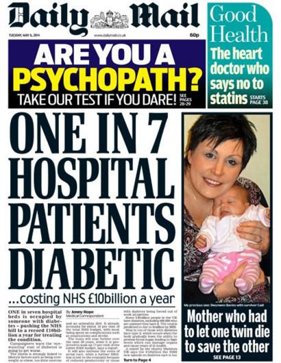
For this terms project we were told to design a front page similar to that of a typical Daily Mail cover.The two stories I chose was the new strand of e.coli found in chicken and the news of Kate Middleton's babies. I decided to mainly research the bacteria found in store produce, consequently i collected enough information to fill the essential part of the page with this research. I used multiple examples of other front pages for example I copied the layout of this:
 As this was a typical layout of a Daily Mail front page and I was able to get a greater understanding of where both images and text were used effectively. The area I found most challenging was either the use of space as I found having blank spots were forbidden and I had to think of something to fill up all spaces, or the headline. I couldn't find the right font as this is still unavailable to everyone. I also had the type each letter individually and then move them correspondingly to reflect the cramped, bold look of the text. I received a lot of different feedback including the use of space which I found very challenging to overcome, also that the headline should be extremely large and crowded. In my opinion I could've improved my use of space, there are a lot of blank sections in the headline which would not be seen in a regular Daily Mail front page. I also think that the skyline could be improved perhaps with more colour in order to reflect that of a normal skyline.
I've learnt the sheer amount of work that goes into a front page every day and the difficulties of finding the best words and sized to fit the page.
Subscribe to:
Comments (Atom)
-
Boys N the Hood In this video the very first image we see is a road sign saying "stop". This idea of stopping could represen...
-
Fruitgasm Advert This advert depicts a series of middle aged working people, starting as sad and having a bad day, this energy drin...

