Daily Mail Front Page
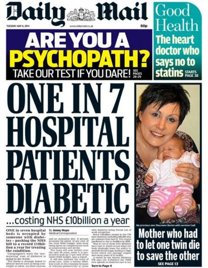
For this terms project we were told to design a front page similar to that of a typical Daily Mail cover.The two stories I chose was the new strand of e.coli found in chicken and the news of Kate Middleton's babies. I decided to mainly research the bacteria found in store produce, consequently i collected enough information to fill the essential part of the page with this research. I used multiple examples of other front pages for example I copied the layout of this:
 As this was a typical layout of a Daily Mail front page and I was able to get a greater understanding of where both images and text were used effectively. The area I found most challenging was either the use of space as I found having blank spots were forbidden and I had to think of something to fill up all spaces, or the headline. I couldn't find the right font as this is still unavailable to everyone. I also had the type each letter individually and then move them correspondingly to reflect the cramped, bold look of the text. I received a lot of different feedback including the use of space which I found very challenging to overcome, also that the headline should be extremely large and crowded. In my opinion I could've improved my use of space, there are a lot of blank sections in the headline which would not be seen in a regular Daily Mail front page. I also think that the skyline could be improved perhaps with more colour in order to reflect that of a normal skyline.
I've learnt the sheer amount of work that goes into a front page every day and the difficulties of finding the best words and sized to fit the page.


No comments:
Post a Comment