Tuesday, 17 December 2019
Thursday, 5 December 2019
Thursday, 21 November 2019
News Values
Key Term: Gate keeping
This is a term applied to the editing and filming process which controls information given out, censoring and changing the story to give limited information.
C - CONTINUITY: stories which continue and runs over a long period of time e.g. Brexit
U - UNAMBIGUOUS: clear, understandable
P - PERSONALISATION: what is the human industry
P - PROXIMITY: how close it is, abroad? same country?
T - THRESHOLD: how big is the news?
U - UNEXPECTEDNESS: how unusual is it?
N - NEGATIVITY: how negative is the news? Is bad news more popular?
E - ELITE PEOPLE/ PLACES: how important are the people/ place in the article
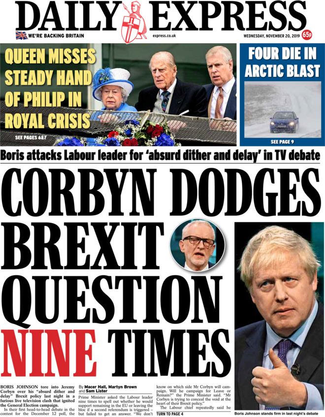
This recent front page of The Daily Express shows all of these ideas. It explores the argument between two very important politicians who decide the future of England. It also informs about the Queen,
Friday, 15 November 2019
Newspapers
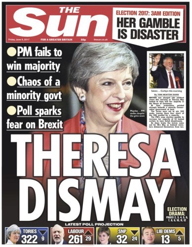
Newspaper name: The Sun
Name of Article: Theresa Dismay
Date: Friday 9th June 2017
Intended Audience:
This newspaper clearly votes away from Tories and uses a limited amount of words but relies more on pictures to put their point across. Resulting in an intended audience to be people from C and D group as they are more working class people who have less time on their hands consequently would rather read a less wordy newspaper.
What is the Article about:
This newspaper explores the problems with the recent Brexit scandal and the troubles with leaving the EU. It claims that Theresa May has done a terrible job as prime minister. This topic would mainly attract older people as they seem more interested with the troubles with politics than younger teens. However, the text to image ratio is low, indicating a lower class intended audience.
The tone of the whole article shows Theresa May as disgrace and embarrassing, failing to meet the countries demands of leaving the EU. The main image used on the front page is a large picture of Theresa May. This unflattering image show the bad side of May as she smiles awkwardly away from the camera, perhaps embarrassed or in shock. This shows Theresa May badly. Theresa May is shown to be a bad Prime Minister.
The Decline in Print Newspaper Circulations

A newspaper which is no longer printed is the The Independent which tried to not be left or right sided which ultimately got less sales.
National Newspapers include The National, The Times, The Daily Mirror and many more.
The Independent has run out of money consequently, only being online. Newspapers which are more right wing are usually more popular.
Mid-Market tabloids have had a steeper decline overall.
Newspapers Conventions
Newspaper Conventions
Tabloids such as "The Sun" have a lower text to image ratio and are typically more opinionated, this is aimed more at the working class people who have less time to read. Front covers of tabloids generally take about 10 seconds to read, however, broadsheets contain much more information and are much less opinionated, The text to image ratio is higher taking longer to read and they tell the full story, the actual news, as opposed to that of a tabloid. Mid-market tabloids, although having a higher text to image ratio contain more opinionated news. Often favouring news of royalty, they are very patriarchal and their logo, a crest on top of each front cover connotes history and a sort of pride to be English. Also shown through over exaggerated fancy font.
Tuesday, 12 November 2019
Newspapers
Question 1-2: unseen
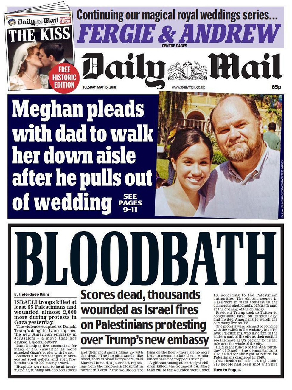
Talks a lot about the monarchy, very patriarchal. More informal, very colloquial language appealing to lower C and D audiences. Tackle both hard news and soft, perhaps to widen there variety of audience, appealing to everyone. Logo/ Name has a very exaggerated, fancy font with a coat of arms in the centre, to make a statement of nationality, typically English, very established. Uses a lot of Moral Panic, very opinionated.
3 kinds of newspaper:
- broadsheet (The Times, The Guardian)
- mid market tabloid (The Daily Express, The Daily Mail)
- tabloid (The Mirror, The Sun)
Influence
Estate 1: Religion
Estate 2: Monarchy
Estate 3: The Wealthy
Estate 4: Newspapers
Hard News - Politics, Science, Violence, Health, Economy
Soft News - Sport, Celebrities, Entertainment
The Daily Mail
Thursday, 7 November 2019
Fruitgasm Advert and Reflection
Fruitgasm Advert
This advert depicts a series of middle aged working people, starting as sad and having a bad day, this energy drink is said to bring you up from a slump and ultimately make you feel happier and more successful, consequently making you more successful. There are a variety of messages within this video, claiming that with your drink you will be able to play sports, dance, laugh and be happy. Literally making your day brighter.
This took quite a while to come up with this idea, struggling on the story line of the advert as well as the logo and name of the product. Finally deciding on a style, story line, name and logo we took 2 days to record everything and edit within that.
For the beginning I turned the saturation of the picture down until it was black and white, I then added a blueish wash over it to further enhance the saddened genre I tried to create. As soon as the man drinks from the bottle, the colour is instantly turned on as well as the saturation is turned up slightly to make everything seem more vibrant and joyful. Combined with the upbeat, jolly song and fast paced dancing, a happy style is portrayed, consequential from the energy drink.
Wednesday, 16 October 2019
Industries
Industry Powerpoint's
Feedback:
- Included most things nicely except Disney
- Add more info on distribution
- Informative and interesting
Thursday, 3 October 2019
Boyz N the Hood
Boys N the Hood
In this video the very first image we see is a road sign saying "stop". This idea of stopping could represent many different things, perhaps safety, the road sign could stop crashes or accidents. Perhaps this idea could be stopping violence or the threat of being hurt. This is combined with a lot of loud noises which could be for a confused effect, or a more realistic busy city audio. There is a diegetic sound of sirens from the very beginning which also connotes danger or if someone was hurt.
In the scene where the children find the blood on the floor, they walk past a police line. This further shows the danger. Combined with the bullet holes in the walls and trash on the floor, we immediately get this idea of a dodgy back alley.
One child is wearing typical, somewhat normal clothing, contrary to what most people think this kid would be wearing the counter type shows knitted jumper with jeans and trainers. This is contrasted with the other boy who wears stereotypical tracksuits and cap which has been twisted backwards. The knitted jumper and jeans shows a sort of posh look which is the opposite to what most people think they would wear. The tracksuit show a more relaxed attitude whilst the cap turned backward could connote a more rebellious tendency.
Lastly, in the final scene the young boy walks past a bunch of men kicking and punching another man. His casual, slow walk shows that this sort of thing happens often, that seeing a violent fight between a group of people is a normal thing to see when walking down the road. Furthermore, the filler lighting gives the whole thing a more realistic feel, as if it is sort of old and rustic. Perhaps slightly more mediocre which would reflect the whole style of everything as they are in a dodgy neighborhood with simply stumbling across countless dodgy scenarios. Also, there seems to mostly be one camera angle throughout (eye level), however, there is one moment when there is a high, long shot above the children as they walk to the crime scene. This is used to show them as vulnerable and small as they walk to a dangerous place, perhaps foreshadowing a bad event. The camera pans from right to left to reveal to the audience the location, further showing a dangerous, dodgy street. This makes the audience worry for a group of children who are wondering around a dangerous area alone, the camera shots as well as the music plays on this fear.
Tuesday, 1 October 2019
Representation
Representation
Disability
Regionalism
Class
Age
Gender
Ethnicity
Sexuality
Stereotypes - visual short cuts, often repeated
Archetypes - ultimate stereotype, exaggerated
Counter type - challenges traditional stereotype
For this task we tried to find 3 stereotypical adverts and 1 counter typical advert.
Coca Cola Advert
This is a counter type as the media portrays men as idealistically straight, the man in this advert fights over the girl to give the overly sexual, exaggerated pool boy a bottle of coke. This man is literally falling head over heals to meet another man which isn't often shown through the media. However, this could also be seen as a stereotype as at the beginning the gay man is seen in a more feminine pose, with the backs of his hands cupping his head. Perhaps this shows gay men as more feminine.
Sexist Car Commercial
I find this advert sexist as it shows women as bad drivers when she parks on top of the hill, it further shows men as better drivers when the husband tells her she was wrong. The driver admits it however but decides to ignore him anyways, perhaps portraying women as wanting to be right always, thus, somewhat inferior to men. Lastly, the boy in the back of the car is dressed in football gear, despite not being a very strong message, this does show that young boys are typically into stronger, more reckless sports and dress accordingly.
Banned Alcohol Advert
This advert is heavily sexist as it shows the woman constantly complaining, showing how women never shut up and always find something to talk about. It then shows how the man unplugs the woman so he can get some peace and quiet, this further shows the man as more powerful as he literally folds his spouse into a role. Lastly, it shows two men at the end sitting down with alcohol, personally I find this sexist as it doesn't highlight the fact that women can drink too, but only emphasizes how beer is a male beverage.
Homophobic Chevrolet Advert
Here, a man is seen singing which makes the other men increasingly uncomfortable as singing is often portrayed as a talent only for women. The advert then highlights this saying there is enough space in the vehicle to lean away from the singing man. Showing a sense of homophobia through the use of awkward facial expressions and the highlighted awkward fact through the narration.
Sound
Sound
Music (parallel) - goes with the images
Contrapuntal - doesn't go with the images
Diegetic - background sound (cars, sirens)
Off screen - sound that isn't shown on camera
Voice over - narration or thoughts
Effect
Dialogue - speech, how the person speaks
The Hunger Games
Here you can see examples of enhanced sound, from the cutting of the rope at the start to the heavy breathing. This creates tension as well as emotion, he heavy breathing connotes terror, as she hyperventilates at the sight of a small girl being shot. It also shows effective use of diegetic sound, the slight clatter of leaves before the older boy emerges from the bushes shows that something is coming. After Katniss saves Rue from the trap the audience are lulled into a false sense of security, which is complemented by the use of now sound. We are able to hear the enhanced sound of breathing and relief as Rue is released.
Monday, 23 September 2019
Thursday, 19 September 2019
Practice Editing
Practice Editing
For this task, we used premiere for the first time. We learnt how to import images and audio and how to edit each shot with colour, or transitions or simple cuts.
Friday, 13 September 2019
Semiotics
Semiotics
Semiotics is the meanings of symbols, for example, red could be the colour of love or aggression. Two opposite ideas however they are both connotations of a simple colour.
Here you a can see the same shape however they have completely different meanings. Before the tragic events of Wold War 2 this pattern was a Buddhist symbol of peace. This is a big example of semiotics as before the late 1920's this symbol meant peace, however, now this connotes so much violence.
Film producers use this to their advantage when creating their posters to advertise the film.
Here this horror movie implies death through the use of broken glass which connotes danger or bad luck. The fact the glass is breaking on a girls screaming face shows pain as well as a literal broken face, signifying the danger through the distorted facial expressions. Across the top of the page is the sentence "rest in pieces". This could show the unforgiving nature of death, this harsh and quite rude statement highlights the fact that death doesn't care who you are or what you have done, which is a running theme in this franchise. The fact that you might've been a good person does not stop death from coming for you, which is further implied through the use of a girls face in the center of the page. Her sunken eyes and skeletal teeth somehow take away from the humanity of this girl, but the use of a girl connotes innocence or somewhat weakness. Furthermore, down the bottom of the right corner there is smoke or fog. The use of fog could signify the inability to see, which creates anxiety as you have lost one of your main senses. This is also shown by the use of a pitch black background, this further highlights the loss of a sense which creates even more anxiety,thus, creating a suspenseful atmosphere. On the other hand, the use of smoke connotes fire, this idea of fire creates further danger as fire can be a powerful unstoppable force. Lastly, the title has a shiny look to it. This could imply a blade or sharp metal object which further shows danger and therefore, death.
Genre
Horror Film Posters
The dark, eerie lighting creates a suspenseful atmosphere. Furthermore, in the second picture, the walls look stone or cobbled, which make it look like the setting is in a dark alleyway at night. The object of interest in he first picture is a gun, which connotes violence and threat, combined with the lack of identity of the person with the hood further creates this eerie, suspenseful atmosphere.
Romance Film Poster
This idea of nature connotes purity and in some cases love,the cluster of leaves above the couple could imply mistletoe which is a very old symbol of love. Furthermore, the two people holding hands in the foreground further shows a romance between the two. The metal fence in the background could imply a boundary or obstacle the two must overcome in order to be together. Clearly we had many limits, such as setting and lighting, but in my opinion i believe we overcame these difficulties.
Musical film Poster
This picture shows a crowd of people standing around a piano, the piano (being a musical instrument) shows the musicality as well as the sparkly cloth draped over the piano implies theatre or something glamorous. Furthermore, the glamorous smiles towards the piano player shows performance. Overall, the vibrant colours and over acted emotions imply a performance.
Monday, 9 September 2019
Introduction to Media
Analyzing a Music Video
Simply sat in a white room behind a white pedestal. On top of the pedestal is a glass full of a black liquid. The plain white highlights the contrasting black liquid, drawing the viewers gaze towards it. The fact that everything is white including her clothes draws out any other colours to make them seem more vibrant.
This is also seen in Steven Spielberg's Schindlers List, where a little girl can be seen wearing a red coat. However, the whole movie is in black and white, which makes the red coat stand out much more and seem more vibrant. Further use of white contrasting with her deep blue hair draws the audiences view to this.This technique makes the audience focus on whatever the producer wants. Her audience consists of mainly teens, who understand her work. She is a self produced singer songwriter who works very closely with her brother Phinneas O'Connel.
Summer Work

Media Mood Board
Subscribe to:
Comments (Atom)
-
Boys N the Hood In this video the very first image we see is a road sign saying "stop". This idea of stopping could represen...
-
Fruitgasm Advert This advert depicts a series of middle aged working people, starting as sad and having a bad day, this energy drin...


